|
|
||||||||||||||||||||||||||||||||||||||||||||||||||||||||||
|
Please sign my Guestbook and leave feedback |
||||||||||||||||||||||||||||||||||||||||||||||||||||||||||
|
Recent Additions Great Kimble (Buckinghamshire) Stamford Church Trail (Various) Kingston on Soar (Nottinghamshire
|
||||||||||||||||||||||||||||||||||||||||||||||||||||||||||
|
A number of years ago I received a copy of “Ideas and Images in Twelfth Century Sculpture” by the late Mary Curtis Webb who died in 1987 . Mary Webb’s daughter, Gillian Greenwood, delighted to have discovered my website with its photographs of Norfolk fonts, contacted me and sent me the last copy of her mother’s book as a gift. As you might expect, I have read innumerable books about church architecture and furnishings but none made the impact on me that this book made. The truth is that in church architecture, as in most fields of study I suppose, much of what you see is just a slightly different version of what someone else has already written. There’s nothing wrong with that, but it makes really original research-based work all the more admirable.
I don’t think it would be unfair to say that most people regard most Romanesque carving as impenetrable to the modern mind (as I largely do myself!). The genius of Mary Webb’s work was to scrutinise carvings in minute detail and then to search the libraries and museums of Europe for material that would explain them. In doing so she gave remarkable insights into the intellectual tensions felt by the academic elite of the twelfth century Church. |
a") |
||||||
a") |
||||||
a") |
a1") |
|||||
|
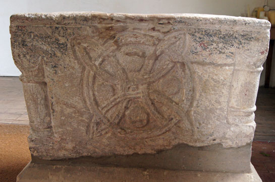
When you look at the complexity of the geometric designs here it is pretty obvious that they must mean something - but what? Mary Webb, having spent much time in the British Museum Reading Room (as it then was) studying photographs of drawings of similar geometric designs in twelfth century manuscripts, came to realise that they are not mere fancies of the carvers, intended as decoration, but have deep meaning. She explains that these geometric designs illustrate the cosmology derived from Plato’s “Timaeus” and the “Theory of Number” written by the Pythagorean mathematician Nicomachus of Gerasa (Gerasa is known today as Jerash in modern Jordan) who died c. 120 AD. The work of Nicomachus was translated into Latin by Boethius (died c. 524 AD) and this arithmetical primer supplied the Middle Ages with the sole text book available on the subject in the schools! |
 |
 |
|||||
 |
||||||
 |
||||||
|
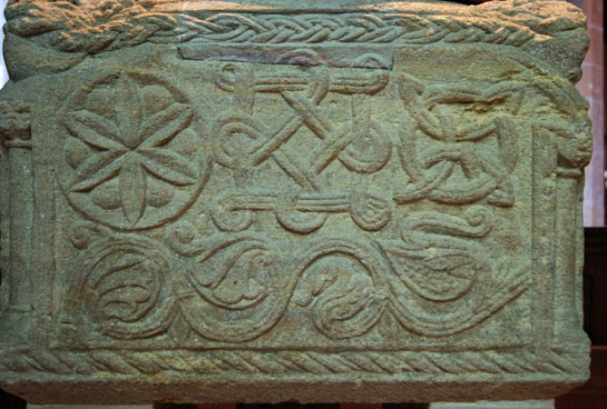
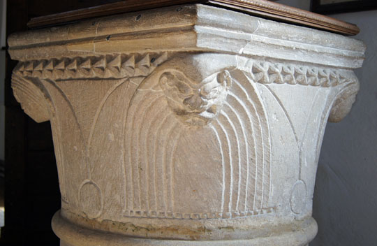
Circles with Interlaced Arcs (Cosmic Harmony) symbolism on fonts at : Above Left: Sculthorpe (Norfolk) Above Right: Bagthorpe (Norfolk) Below Left: Rock (Worcestershire) Below Right: Stottesden (Shropshire) |
|
Sculthorpe and Bagthorpe are two of a cluster of Norfolk churches whose fonts have this design. The others are Toftrees and Shernborne. Stottesden and Rock are both carved by the Herefordshire School of carvers. There is another cluster in Northamptonshire that encompasses Braybrooke, Thornby, Aston-le-Walls and Mears Ashby in Northamptonshire. It is interesting that the Bagthorpe font has only this one carving: the other three sides are blank. It is quite obvious, therefore, that this was not regarded as a piece of simple decoration: someone was determined that it should be there. There is another example of this design - not, for once, on a font but on a door capital - in Dearham (Cumbria). Again, someone went to some trouble to carve it on an otherwise undecorated church. |
||||
 |
 |
|||
|
Left: Dearham south doorway with circle-interlaced-with-arcs (there really should be a more succinct name for this design!) Right: Greetham (Rutland) |
|
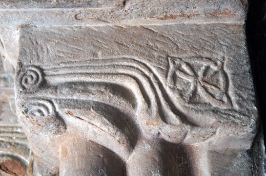
We still haven’t finished with Sculthorpe font, however. When we look at it - and indeed all of the churches that comprise the so-called “North West Norfolk School” - we see all four corners decorated with a head. This is possibly the most recurrent feature (although not ever-present by any means) on rectangular-profile Norman fonts in England. I quote Bob Trubshaw: |
|
The Selby Abbey Group |
|
Obviously Mary Webb could not visit every church in the country - even every Norman church - looking for every example of Platonist symbolism. So I have been able to discover occasional examples for myself, as you will see. By far the most significant find has been what I call the Selby Abbey group: a group of four churches all with Webb-ian imagery. Their discovery was pure serendipity: I visited Riccall Church which is famous for its Norman south door and followed up on the same day with Skipwith and Stillingfleet, both with Norman features. When I examined the photographs at the end of the day to my amazement I found Mary Webb’s imagery at each. A couple of days later I visited another slew of Norman churches in the area and found more imagery at Birkin Church. These four places are all within ten miles of Selby Abbey. I will discuss further in the article the significance of monastic involvement but at this point I will make the simple observation that there is no conceivable way that a Norman mason would have been familiar with such esoteric concepts himself. He must surely have had guidance of an educated elite and at this time that meant the monasteries. The clustering of these churches (and similarly on fonts in Norfolk and Nothants) leaves monastic influence as the only real explanation. It is true that there are single examples in some areas but on the whole this is unusual and possibly owes something to the disappearance of Norman features and, in particular, of Norman south doorways over the centuries. |
|
|
||||||||||||||||||||||||||||||||||||||||||||||||
a")
a")
a")
a")
")
|
I would make the case that the Norman door at Skipwith (as opposed to doorway) is arguably the most spectacular manifestation of the Mary Webb designs to be seen anywhere. although the fonts at Hampstead Norreys and Sculthorpe are perhaps more important in terms of their iconography. The ironwork above right is a circle intertwined by six arcs. Mary Webb doesn’t talk much about this image but she did find it illustrated in the 1120 “Liber Floridus” of St Omer along with other philosophical imagery. As you can see in the picture left, it appears eight times down the centre line of the door so it is obviously of some significance. I was studying that when I had the eureka moment when I realised the whole door is adorned with two full and two partial reprsentations of the circle interlaced by four arcs! I described it to Gillian Greenwood (Mary’s daughter) as “hiding in plain sight”. Remarkably, the doors at Rochester Cathedral are almost identical. I think then that it is QED that the circles with six arcs is itself of significance. We are left to wonder at the other geometric designs which are both elaborate and, to my eyes, beautiful. |
a") |
|||||
a") |
a") |
||||
|
Left: Birkin Church is a spectacular Norman church that deserves to be better known. It has an elaborate south doorway and the very first motif (all of them in circular rosette settings) of the west side of the arch is our old friend the circle interlaced by four arcs. It is somewhat weathered but clearly visible. Intriguingly we then find two more geometric designs - again amongst almost exclusively historiated designs. Centre: We see a triangle interlaced with three arcs! Mary Webb did not discuss such a design but its significance should be judged by its appearing diametrically opposite the circle design as the first on the east side. We have to remember that if Mary Webb did not see the design then she will not necessarily have investigated it and she assuredly did not visit Birkin Church. I suppose there is an outside chance that the sculptor decided to create an image of his own, paralleling but not reproducing the one on the other side of the arch but I judge it to be unlikely. Right: Another enigmatic design. The central piece is possibly a star and it has four loops. Again, Mary Webb has nothing to parallel it in her book but I believe that the same motif appears again on the Abbess’s door at Romsey Abbey in Hampshire. The peculiar thing is that Mary’s book contains a picture of the very doorway upon which it appears. She was using it, however, to make a parallel between grape cluster motifs there and at the very significant doorway at Dinton in Buckinghamshire. That is a rather esoteric point that we don’t need to repeat here. However, I don’t believe Mary actually visited Romsey Abbey. the photograph was copied from a book by the then- famous George Zarnecki and the detail is poor. If she had a high-resolution picture (and one that was not face-on) I think she would have noticed a geometric carving on the west capital that would have excited her. |
|
|
||||||||||||||||||||||||||||
b")

|
Above: The west inner capital. This is, I think, a “square interlaced with arcs” that has been made rectangular in order to wrap around the capital. The arcs are very clear. There is also a cross shape within the rectangle and we can see arcs winding around the top and bottom planes, To left and right there are no arcs. Nevertheless, this is a design that parallels one found in the porch of St Peter’s Church, Northampton and on the font at Stottesden (see above). I think it is meant to be a “rhomb on an oblong” and Mary Webb believed to believes it to represent harmonic proportion and the “reconciliation of good and evil”. See also Hampstead Norreys font above. Taking all of this into account, including the bunches of grapes that first excited Mary Webb’s interest and given that this was an abbey - a seat of learning - I believe that it is reasonable to suggest that the whole composition was informed by the platonist view of the world. |
|
Remarkably, Mary Webb’s book shows no photographs of external representations of this iconography (as opposed to the themes later in this article). There are diagrams but these do not show context. Two things strike me. Firstly the symbolism is always outside the church unless it is on a font. I have seen no examples of their appearance on, for example, chancel arch or tower arch capitals. Secondly, every external example is on the south side of the church. In all but one case - Steetly in Derbyshire - they are on doorways. At Steetly, uniquely as far as I know, there is at least one and possibly two representations of the circle enclosed by arcs on the corbel table but again on the south side. One of the two could be another platonic symbol but it is difficult to make it out. |
||||||||
 |
 |
|||||||
|
Left: Circle with arcs symbol at Steetly. Right: A more debatable Steetly corbel. |
||||||||
|
Stoke Canon Font, Devon |
||||||||
|
Stoke Canon Church is not one that you would regard as unmissable although it is re-establishing itself as a community centre in a way that I thoroughly approve of. I went simply because it has a Norman font. It is a font, however, that strikes you immediately as being very much in the style of those that Mary Webb researched so thoroughly. |
 |
|||||||||||
 |
|||||||||||
 |
|||||||||||
 |
|||||||||||
|
All four sides are variations on a theme. Each has a diagonal cross with three or four strands to each arm with variations in the way the arms of the cross intersect at the centre. Each arm of each cross has curled designs at each end. Two of the sides have a circle within the cross. One (top left) has two circles and one (top right) has none. Mary Webb’s daughter (who arranged her mother’s papers and actually produced the book) is as certain as I am that all four are also intended to be representations of the Greek view of the Cosmos. As she says herself “What a pity she (her mother) isn't here to tell us what she thinks”. After reading Mary Webb’s work it seems inconceivable that she would not have regarded this font as part of the same decorative and symbolic tradition. |
|||||||||||
 |
 |
 |
|||||||||
|
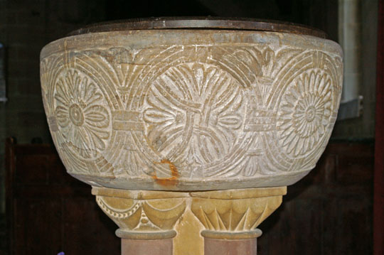
Mary Webb also saw the circle with interlaces arcs imagery on some of the celebrated Isle of Lewis Chessmen. Above Left and Centre: are images of a king and a bishop. There are others but it is something of a nightmare to find sideways-on images of the pieces. They are, like the fonts, of twelfth century origin. They are also - and this is the interesting bit - believed to have been carved not in Britain but in Norway. Mary Webb’s research found many examples of this image throughout Europe, but perhaps its use here is one of the most iconic. Right: The font at Preston (Suffolk). Mary also found the imagery on the fonts at: East Dean (Sussex) and Bisley (Glos). |
|||||||||||
|
A Scandinavian Device? Anyone with an in interest in first millennium history will agree with me that what we call “Anglo-Saxon England” was, for over two hundred years, more a case of Anglo-Saxon-Scandinavian England. We use the word “Viking” (which is close in meaning to “pirates”) loosely to describe the Nordic incomers and in doing so conjure up visions of tattooed lunatics with axes and shields, raping and pillaging at will. To be sure, there was a lot of that. Contemporary Anglo-Saxon chroniclers certainly saw it that way, although the thing they hated the most - and which distorted all of their accounts - was that the invaders were “heathen” and particularly targeted rich and vulnerable monasteries. Conquest, war and pillage were things the island was used to. The Vikings were just rather better at it - at least until Wessex under Alfred the Great and his successors changed the narrative of war into set-piece pitched battles at which the Scandinavians were not nearly so adept. We have huge gaps in our knowledge of how Anglo-Saxons and Scandinavians co-existed, but co-exist they did. When the Danelaw was created do we suppose that the Anglo-Saxons in those areas were all murdered? Of course not. Do we suppose that every Scandinavian was still a marauder after three or four generations? Again, of course not - although some undoubtedly were warriors first and foremost. Do we believe that Scandinavians and Anglo-Saxons who were all of Germanic origins and who had elements of a common language did not marry and produce “mixed race” offspring? That they did not farm the land to feed themselves and their families? And then we have to factor in the Very Important Fact that by the late pre-Conquest period nearly all “Vikings” had become Christians! And do we believe that the Scandinavians had no cultural or intellectual qualities? Again, of course not. They influenced and were influenced by late Anglo-Saxon culture and ideas. We see that on many a page on this website. So, with all of that in mind, one thing that strikes me about the occurrence of neo-Platonic devices in English churches is that they occur far more within the boundaries of what we today call the Danelaw. Cumbria has Dearham, St Bees and Ireby. The Northamptonshire and Norfolk fonts all occur within the Danelaw and so does Northampton itself (see below). As does the “Selby Abbey Group”. Against these we can place Hampstead Norreys - on the boundaries of the Danelaw - and Stoke Abbott, an indisputable and startling outlier. East Dean and Bisley are others. But, on the whole, there seems little to be seen in the Anglo-Saxon kingdoms of Mercia and Wessex. Nor, tellingly, in the northern Northumbrian kingdom of Bernicia based around Bamburgh, adjoining Norse-dominated Cumbria and largely left alone by the Danes based in York (or Jorvik). Then we have the phenomenon, noted above, of the Lewis Chess Pieces. Was the neo-Platonic imagery then something that had particular resonance with the Scandinavian intellectual elite (which must have existed but we rarely hear about)? Of course, all of the examples Mary Webb and myself have found in England are of the Norman era. But we need to remember that the Normans were also descended from Vikings settled in that area by the besieged King of France. What is especially interesting is that none of the two hundred plus cross slabs - many overtly sculpted by Norse incomers - on the Isle of Man display any of this imagery. The island’s culture at that time was a Celto-Scandinavian one, this never having been an Anglo-Saxon settlement. This reinforces the intriguing question as to why the neo-Platonic imagery did not surface in Britain until the Normans? As you will see if you read my page on “Mary Curtis Webb in Europe” Ravenna in Italy has a fifth century example, Narbonne (far from Normandy) a sixth century one. In truth, however, there it seems the eleventh and twelfth centuries were the heyday of its use. As always there are far more questions than answers. For now I will just leave you with the thought that although the imagery was, as you would expect, in continuous use in first millennium Europe, at least from the fifth century, it became more common much later. And that just maybe, it had most resonance with the Scandinavian disapora. When they were not massacring people, of course! |
 |
|||||||||||||||||||||||||||||||||||||||||||||||||||||||||||||||||||||
 |
|||||||||||||||||||||||||||||||||||||||||||||||||||||||||||||||||||||
|
Left: Egleton Font Right: Egleton Tympanum |
|||||||||||||||||||||||||||||||||||||||||||||||||||||||||||||||||||||
|
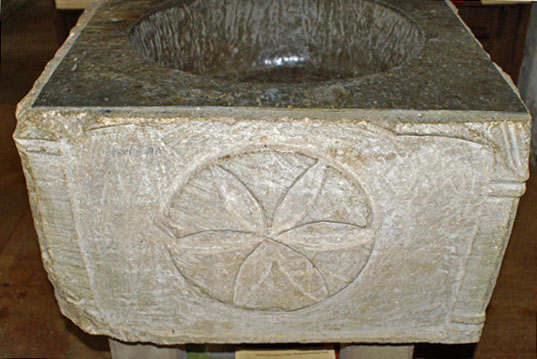
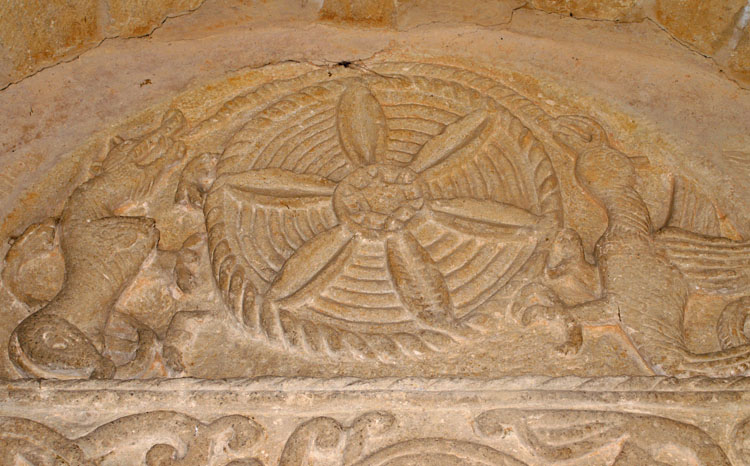
The Euclidian “Flower” Mary Webb’s work is extremely convincing and is backed by an awesome body of ancient manuscripts and philosophical documents. Once you have “bought into” her arguments, they provoke a whole new mindset when looking at Romanesque carvings. When we look at Sculthorpe font (picture above), one side has a trio of large geometric carvings. As we have seen Mary Webb had explanations for both the the central “square on a square” and the right hand “Circle with Interlaced Arcs” motifs. They are found on other Norman fonts in England, including at Rock in Worcestershire pictured above. So what then are we to make of the left hand flower-shaped motif? Mary Webb does not discuss this but, having read her work, it seems inconceivable that the carver just thought he would complement the other designs with a pretty doodle. Yet it is a common enough design in Romanesque sculpture as we shall see. So does it owe anything to Greek philosophy in the way that the other designs do? Well, a website written by the American Sim Ayers attributes this design to Euclidian geometry - see http://www.sbebuilders .com/tools/geometry/treatise/Applied-Geometry.html. Nobody seems quite sure what it means. Sim Ayers himself writes: “The six petal flower design may also be a signature, left behind during the passage of an apprentice geometer or apprentice mason, one who knows the road to Euclid. When you see the Euclidean six point geometric drawing on the Knights Templar tombstone at St Magnus Cathedral in Kirkwall, is it a six petal flower design, daisy wheel or a religious sex symbol, or the seed of life symbol or just six point geometric construction?” A fellow church historian, Bob Trubshaw, points out very reasonably that this design is ubiquitous possibly because it was relatively simple for a carver to draw with compasses. When you see it on Sculthorpe font alongside two other Greek-inspired designs, though, I think it is reasonable to conclude that it too had some more intellectual significance. There are other examples shown on my website: a Norman door at Bredwardine; a stone relocated to serve as a window sill in Eardisley; and on the font at Egleton in Rutland. Geometric they may be, draw-able with compasses they may be, but the carvers at Sculthorpe, Bredwardine and Eardisley did not stop at that. The six “petals” were decorated with veins to make sure we knew they were indeed leaves or petals. The carvers also included circles between the petals. Again, it is hard to see that there was no significance to this. Note also that both the Toftrees carving and that at Bredwardine have a pair of concentric circles at their perimeters . This is surely not a coincidence either but has some deeper significance. What is fascinating is that once you accept Mary Webb’s assertion that some of the designs are not random patterns but have religio-philosophical meaning you quickly realise that other designs may also have such significance. |
|||||||||||||||||||||||||||||||||||||||||||||||||||||||||||||||||||||
|
Until surprisingly recently there were those that would argue that monks and clerics had a great deal to do with the design and development of English churches. That notion is now completely discredited. We know the stonemasons and not the clergy were the principal players. The argument for clerical oversight is the same one which denies the humble origins of William Shakespeare (“The Earl of Oxford”, “Sir Francis Bacon” forsooth) - a rather English contempt, frankly, for the abilities of those humbly born. Yet it is certainly true that our masons were unread. They had mastery of the important proportions and ratios needed for sound and elegant buildings, mastery that no priest would ever have had. With measuring stick, a pair of compasses and a set square they could build you a church that would stand for two thousand years. They did not, however, have any notion of Plato! |
|||||||||||||||||||||||||||||||||||||||||||||||||||||||||||||||||||||
 |
|||||||||||||||||||||||||||||||||||||||||||||||||||||||||||||||||||||
|
Pitsford Tympanum |
|||||||||||||||||||||||||||||||||||||||||||||||||||||||||||||||||||||
 |
|||||||||||||||||||||||||||||||||||||||||||||||||||||||||||||||||||||
a") |
|||||||||||||||||||||||||||||||||||||||||||||||||||||||||||||||||||||
|
Dinton Tympanum and Lintel |
|||||||||||||||||||||||||||||||||||||||||||||||||||||||||||||||||||||
|
Mary Webb was so struck by the parallel symbolism on these two tympanums that she goes so far as to propose the possibility of a common artist. At best, some of us might be able to draw some meaning from these two designs. Mary Webb, however, was able to understand the significance of every single element. Nothing was beyond interpretation, nothing that the carver did was random or invented. She traces the whole lot to “Moralia in Job” a work by Pope Gregory the Great derived from the biblical Book of Job. You have available to you from this page, the whole of Mary Webb’s text so it would be absurd to try to paraphrase it all here. Please refer to Chapter 2. |
|||||||||||||||||||||||||||||||||||||||||||||||||||||||||||||||||||||
|
The Winged and Laughing Christ |
|||||||||||||||||||||||||||||||||||||||||||||||||||||||||||||||||||||
a") |
|||||||||||||||||||||||||||||||||||||||||||||||||||||||||||||||||||||
|
Southwell Minster |
|||||||||||||||||||||||||||||||||||||||||||||||||||||||||||||||||||||
|
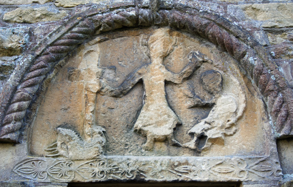
Mary Webb explains that this image is, again, from Gregory the Great in his “Moralia in Job”. Gregory talks of Christ in the form of a bird and, surprisingly to our modern eyes, as a Vulture who “while remaining in the loftiness of His divine nature, marked as from a flight on high, the carcass of our mortal being down below, and let Himself drop from the region of the heaven to the lowest places...He found death among us who was deathless Himself. Now the eye of the Vulture was actually aiming at our resurrection, because He Himself being dead three days, set us free from everlasting death”. At Dinton, Southwell and elsewhere this winged Christ is smiling in mockery as he slays the Devil in the form of Leviathan. We can see other examples at Ault Hucknall in Derbyshire, at Hoveringham in Nottinghamshire and at St Bee’s in Cumbria. |
|||||||||||||||||||||||||||||||||||||||||||||||||||||||||||||||||||||
a") |
|||||||||||||||||||||||||||||||||||||||||||||||||||||||||||||||||||||
") |
|||||||||||||||||||||||||||||||||||||||||||||||||||||||||||||||||||||
|
Tympanum, Hoveringham |
|||||||||||||||||||||||||||||||||||||||||||||||||||||||||||||||||||||
|
St Bee’s Church, Cumbria |
|||||||||||||||||||||||||||||||||||||||||||||||||||||||||||||||||||||
a") |
|||||||||||||||||||||||||||||||||||||||||||||||||||||||||||||||||||||
a") |
|||||||||||||||||||||||||||||||||||||||||||||||||||||||||||||||||||||
a") |
|||||||||||||||||||||||||||||||||||||||||||||||||||||||||||||||||||||
|
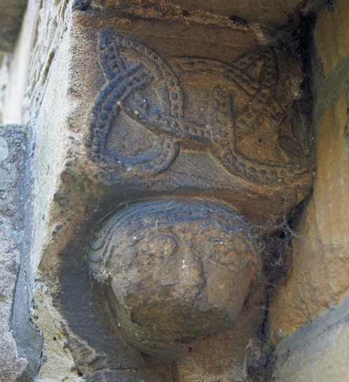
St Bees (named after St Bega) was not a place that Mary Webb discovered during her research. In July 2016 I visited myself and found no fewer than three of the images that had so preoccupied her. A door lintel is preserved outside the west end of the church and (top left) Christ is fighting with Leviathan. This is a particularly Scandinavian looking monster in keeping with the location that was under heavy Viking influence. Christ’s head and sword can just be seen to the left of Leviathan’s gaping mouth. On the same lintel (lower left) we see a “square on square” image. Compare this with the examples on Sculthorpe and Hampstead Norreys fonts above. The loops that weave amongst the sides of the main square leave little room at the middle for another square to be formed but the imagery is quite unmistakable. Mary Webb describes as representing the “perfection of number: a cube represented as two superimposed squares”. Within the church is an impressive collection of ancient grave slabs and other carvings, many of them pre-Conquest. I found this one amongst them (right) with the unmistakable design of the circle interlaced with arcs. When I first wrote about St Bees I wondered whether this is England’s only example of a Platonic theme preserved on a grave slab? It is surely significant that the design was used on a grave slab: the imagery was Platonic but Plato’s view of the Cosmos was seen as an orthodox part of the Christian view of the world, not as a abstract piece of atheist philosophy. Plato explained the Cosmos - but God created it. |
|||||||||||||||||||||||||||||||||||||||||||||||||||||||||||||||||||||
a") |
|||||||||||||||||||||||||||||||||||||||||||||||||||||||||||||||||||||
a") |
 |
||||||||||||||||||||||||||||||||||||||||||||||||||||||||||||||||||||
|
Left: The Norman font at Ireby “New” Church (it came from the much older “Old Church” which is now maintained by the Redundant Churches Fund), near Wigton in Cumbria, is perhaps second only to Hampstead Norreys by the boldness and clarity of its statement. Centre: St Bees was not the only church to have a cross slab with the Cosmic Harmony symbol, as it turns out: this one is preserved in the porch at Bakewell in Derbyshire. It is interesting to see at St Bees and at Bakewell that the design on these slabs is used as a cross head. Right: The font at Bisley, Gloucestershire. Note the “Solomon’s Knot” device n3ct to the circle with arcs. See below for more on this. |
|||||||||||||||||||||||||||||||||||||||||||||||||||||||||||||||||||||
|
The Ransom Theory of the Salvation of the World So far, this page has used as its premise Mary Webb’s theories on the Creation of the World as seen by the Greeks. She also, however, identified at several of our churches the depiction of a long-superseded ancient theory of the Salvation of the World - the so called “Ransom Theory”. The principal basis for her research was Hampstead Norreys Church font in Berkshire - now housed in Stone Church in the same county - upon which both the Creation and Salvation theories are depicted. |
|||||||||||||||||||||||||||||||||||||||||||||||||||||||||||||||||||||
 |
 |
||||||||||||||||||||||||||||||||||||||||||||||||||||||||||||||||||||
|
Left: The tympanum above the north door at Beckford Church in Worcestershire, illustrating the Ransom Theory. Christ is spearing Satan with his cross. He holds a cord in his left hand with which to bind Satan. Adam is being released. Right: One of the capitals on the north doorway. Note the geometric design. Given that all Mary Webb discovered and its proximity to the “Ransom Theory” tympanum we are entitled to ask “what does this mean?” |
|||||||||||||||||||||||||||||||||||||||||||||||||||||||||||||||||||||
|
I return to the words of Gillian Greenwood: “ Mary Webb came to see that the carvings on the two sides of the (Hampstead Norreys) font have to be considered, not separately, but as a whole, because they in fact depict the Two Works of God – the Work of the Creation of the World and the Work of the Salvation of the World. |
|||||||||||||||||||||||||||||||||||||||||||||||||||||||||||||||||||||
|
In contrasting the two sides of the font the elaborate geometric carvings which had apparently been dismissed as mere decoration are shown to illustrate the cosmology derived from Plato’s Timaeus and the theory of Number to be found in Boethius’ Arithmetic . These carvings depict the Creation of the World. |
|||||||||||||||||||||||||||||||||||||||||||||||||||||||||||||||||||||
|
“Solomon’s Knot” Finally, I turn to the most ubiquitous of the designs discussed in Mary Webb’s book - the so-called “Solomon’s Knot” of two interlaced loops. It isn’t a knot (you couldn’t tie it!) and it has little or nothing to do with Solomon other than it came to be seen as a symbol of his knowledge and his proverbial wisdom. It appears all over the world, however, and certainly pre-dates Christianity. So let us acknowledge immediately that this symbol is not exclusively Christian and, moreover, its appearance on English (and other churches) might be merely decorative. If you have been reading the rest of this article, however, and definitely if you read Mary’s book you will surely be wondering if maybe the knot has deeper significance. |
|||||||||||||||||||||||||||||||||||||||||||||||||||||||||||||||||||||
 |
|||||||||||||||||||||||||||||||||||||||||||||||||||||||||||||||||||||
a") |
|||||||||||||||||||||||||||||||||||||||||||||||||||||||||||||||||||||
|
Plato’s Cosmic Harmony Left: Kirkburn Font, Yorkshire Right: Sculthorpe Font, Norfolk |
|||||||||||||||||||||||||||||||||||||||||||||||||||||||||||||||||||||
|
Interestingly, the article reproduced below appeared in “The Times” on 31 October 2016. Note that date. Heritage England (what was wrong with “English Heritage”, by the way and how much did the name change cost?) obviously wanted some headline-grabbing PR on Hallowe’en. It suggests our old friends Solomon’s Knot and the Euclidian Flower as being “apotropaic” symbols. Now when I hear that rather pretentious word I usually reach for my gun because it is habitually used by armchair anthropologists to explain any and every church carving that they see. Carved friezes, sheela-na-gigs, gargoyles? All apotropaic, Old Boy they say loftily, pointing to similar carvings in Polynesia, darkest Africa and the more obscure corners of South America. HE, characteristically, show no evidence for their conclusions. Yet, HE are not idiots and if these symbols are indeed ubiquitous on the outsides of mediaeval England then there must be a reason and I have to say that their claim seems eminently plausible. Indeed, it’s emotionally attractive. Does this challenge any of what I have already written here? No, not really. Mary Webb was talking of an era centuries before Englishmen started living in stone houses. By the time these carvings were appearing on secular houses in England the influence of Plato and his pals on English religious thought was long gone. Mary Webb quite clearly acknowledged the appearance of Solomon’s Knot (which is no more than a name of convenience) in many cultures and with many possible meanings before and after the spread of Christianity. It is a great pity that Heritage England (or the Times) in their use of a picture of an unspecified church conflate the use of the symbols on secular buildings with their use at churches and thereby imply that neither date nor context are an issue.. It is worth mentioning that the connection between witchcraft and the Devil’s work was always a complex and changing one. Witches were regarded not as the embodiment of the Devil but as having been seduced (often physically and mentally) by him. Witchcraft, indeed, was not usually, as is popularly believed, punishable by burning. More generally it was punishable by hanging for it was seen as a crime and not as a religious offence, despite its associations with the Devil. Ambivalence is created by popular history such as, for example, the burning of Joan of Arc - the so-called “Witch of Orleans”. You don’t have to be particularly cute to deduce that politics often came into some of this. Ask Henry VIII. This implies that we cannot treat popular mediaeval superstition and Christian apotropaia as being one and the same. Turning to the Euclidian Flower, it is myself who has suggested the possibility that it is part of the Platonic symbolism researched by Mary Webb. Sim Ayers postulates a link with Euclidian geometry - a theory complementary to Mary Webb’s work. At a more prosaic level, Bob Trubshaw speculates that it is no more than a decorative design easily drawn with the use of compasses. The picture shown in the Times article reinforces that. All of those theories are possible and with such an easily reproduced design we should not be surprised if it has been used in many ways over many centuries. That, indeed, is the only possible conclusion to this whole question. Symbols are timeless but their meanings are not and context is everything. A symbol that is apotropaic in tenth century Polynesia is not necessarily so in eleventh century England or fifteenth century France, for example. Nor, Heritage England, does a symbol on the side of Egleton’s twelfth century font necessarily have the same meaning as on the outside of Shakespeare’s sixteenth century birthplace! |
|||||||||||||||||||||||||||||||||||||||||||||||||||||||||||||||||||||
|
Are the Neo-Platonist Gometric carvings found elsewhere in Europe? Follow this link to find out! |
|||||||||||||||||||||||||||||||||||||||||||||||||||||||||||||||||||||
 |
|||||||||||||||||||||||||||||||||||||||||||||||||||||||||||||||||||||
|
Conclusions |
|||||||||||||||||||||||||||||||||||||||||||||||||||||||||||||||||||||
|
|
|||||||||||||||||||||||||||||||||||||||||||||||||||||||||||||||||||||
|
Please leave feedback in my Guestbook |
|||||||||||||||||||||||||||||||||||||||||||||||||||||||||||||||||||||