|
|
||||||||||||||||||||||||||||||||||||||||||||||||||||||||||
|
Please sign my Guestbook and leave feedback |
||||||||||||||||||||||||||||||||||||||||||||||||||||||||||
|
Recent Additions |
||||||||||||||||||||||||||||||||||||||||||||||||||||||||||
|
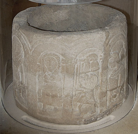
This page looks at a group of Norman fonts all of which are located in the north west of Yorkshire. They are regarded as most commentators as forming a distinct group. The churches are: North Grimston, Cowlam, Langtoft and Kirkburn (not to be confused with Kirkdale that also has a page on this site). In the normal course of events only Kirkburn Church would be is sufficiently interesting to warrant a page of its own on my website. The other three churches are of varying degrees of interest in their own right but would be on nobody’s “must visit” list other than for their fonts. Believe me, though, if Norman fonts are your “bag” then you won’t want to miss any of these four. I have a similar page on the North West Norfolk School of fonts. Frustratingly, the group should include two more examples from the churches of Hutton Cranswick and Everingham. Hutton Cranswick’s font is now in the Hull & East Riding Museum. |
|||||
 |
|||||
|
Bizarrely and unforgivably the font from Everingham was auctioned by Sothebys in 2003 and is now in an unknown location in the USA. That tells you all you need to know about this country’s attitude to artisanal art. You can see images on : http://www.crsbi.ac.uk/site/513/. The two groups, however, are totally different. Norfolk’s fonts are all square in plan characterised by elaborate geometric designs with beast heads at each of their four corners. The skill of the carver or carvers is of the highest order. Moreover, the work of the late Mary Curtis Webb has proved pretty conclusively that some if not all of the geometric designs had their roots in the Greek view of the Cosmos and that, therefore, the hands of the carvers were guided by educated monks. See a brief synopsis of how it relates to the North West Norfolk fonts here: The Research of Mary Curtis Webb You can download Mary Webb’s work free of charge from here : http://search.ugent.be/meercat/x/view/rug01/001879684. It’s a 200 page document and a weighty read but it might, as it did for myself, give you a brand new insight into early Christian thinking. You can also obtain it in paper or CD format for a nominal charge from Mary’s daughter, Gillian Greenwood at gillyflower123@googlemail.com. This Yorkshire group of fonts on the other hand, are circular in cross section and feature almost exclusively scenes from the Bible. In the main they are easy to “read”. So they are the polar opposite of the North West Norfolk School. Then there is the Herefordshire School of fonts (and, of course, other carved objects). They too are circular. Their subject matter is a mixture of symbolic and biblical. So why do we (or rather, the cognoscenti) talk about those other nexuses of work as “schools” whilst talking of the Yorkshire “group” of fonts? A good question! I think we might start by suggesting that this Yorkshire group of fonts are not in the same league in terms of the skills of the carvers. The other groups are of very fine quality - particularly the Herefordshire School as represented by, for example, Eardisley, Chaddesley Corbett and Castle Frome and there is a quite distinctive similarity in techniques. Many - myself included - would say that these represent the very pinnacle of Norman art in England. The Norfolk Group has some commonalities in their design and it is possible that one or two were even executed by the same carver. The Yorkshire group, however, show little common design. None of them are of high quality and two of them - North Grimston and Kirkburn - have images that are quite child-like in their execution. They have the appearance of religious folk art. We need to be careful though. The Bible was only in Latin until the c16. In Norman times virtually the only people who could read it were monks and clergy. Our carvers would have received their knowledge only secondhand. and despite their crudeness these fonts do show a knowledge of biblical stories that went beyond the superficial. So it is likely that monks were responsible for guiding these carvers as they were in Norfolk. The difference here is that the Norfolk fonts with their obscure symbolism and, to a lesser extent, the Herefordshire School could “talk” only to the educated elite; those in Yorkshire talked to the people. So the Yorkshire group are perhaps the “poor relations”. Yet that is what makes them so exciting. They reflect the earnest and unpretentious efforts of the common artisan craftsman. They have more in common with the cave paintings of Lascaux than with the renaissance masterpieces of the National Gallery. Our parish churches are the only places you will see the everyday art of the Anglo-Saxon and Norman periods. They were not commissioned by Kings and warlords. They were of the people for the people. So please try to see all of these wonderful pieces and don’t fall into the trap of regarding these humble Yorkshire fonts as somehow beneath your attention. |
|||||